10 - VBOX Test Suite Chart
Introduction
The 'Chart' tab is where the user can access all the functionality of the chart. This tab will be displayed when the user clicks anywhere on the chart area and will automatically be selected.
Ribbon Bar

Note: Ribbon bar icons may move/ resize dependent on the Software window size.
Data
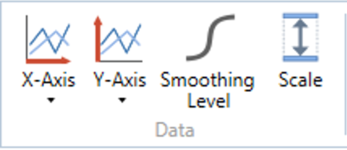
X-Axis
The 'X-Axis' button allows the user to specify which channel is used for the X-Axis of the selected graph. Selecting the X-Axis button will display a drop down list of all available channels, plus a calculated channel called ‘Elapsed time’. The user can then select a channel to display on the X-Axis of the selected graph. All channels in the drop down list are grouped by type such as VBOX or a connected module. The drop down list is also searchable making required channels easier to locate.
Y-Axis
The 'Y-Axis' button allows the user to specify which channel is display as a trace on the graph. Selecting the 'Y-Axis' button will display a drop down list of all available channels in the file or that are being sent across the live serial stream from a VBOX. All channels in the drop down list are grouped by type such as VBOX or a connected module. The drop down list is also searchable making required channels easier to locate.
Every time the user selects a channel, a new Y-Axis will be added to the selected chart and a trace of that channel vs the selected X-axis will be displayed (for example speed vs time). The user can add multiple channels, with each channel adding a new trace. Deselecting a channel will remove this trace from the graph.
Smoothing Level
The 'Smoothing Level' button opens a box that allows the user to set the smoothing level of any active channels on the chart.
Scale
The scale level button opens a box that allows the user to set the y axis scale range of any active channels on the chart. This can either be done by manually setting an upper and lower value, or by ticking the ‘Auto’ option to automatically set the axis to the maximum and minimum value.
Display
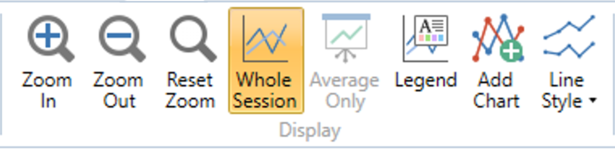
Zoom In
The 'Zoom in' button zooms in on the graph, centred on the cursor position.
Zoom Out
The 'Zoom out' button zooms out on the graph, centred on the cursor position.
Reset Zoom
The 'Reset zoom' button returns the graph to full view.
Run Compare
The 'Run Compare' button allows the user to switch between viewing the whole file to individual runs from the results table.
The standard display highlights regions of the graph to indicate where the selected runs occur.
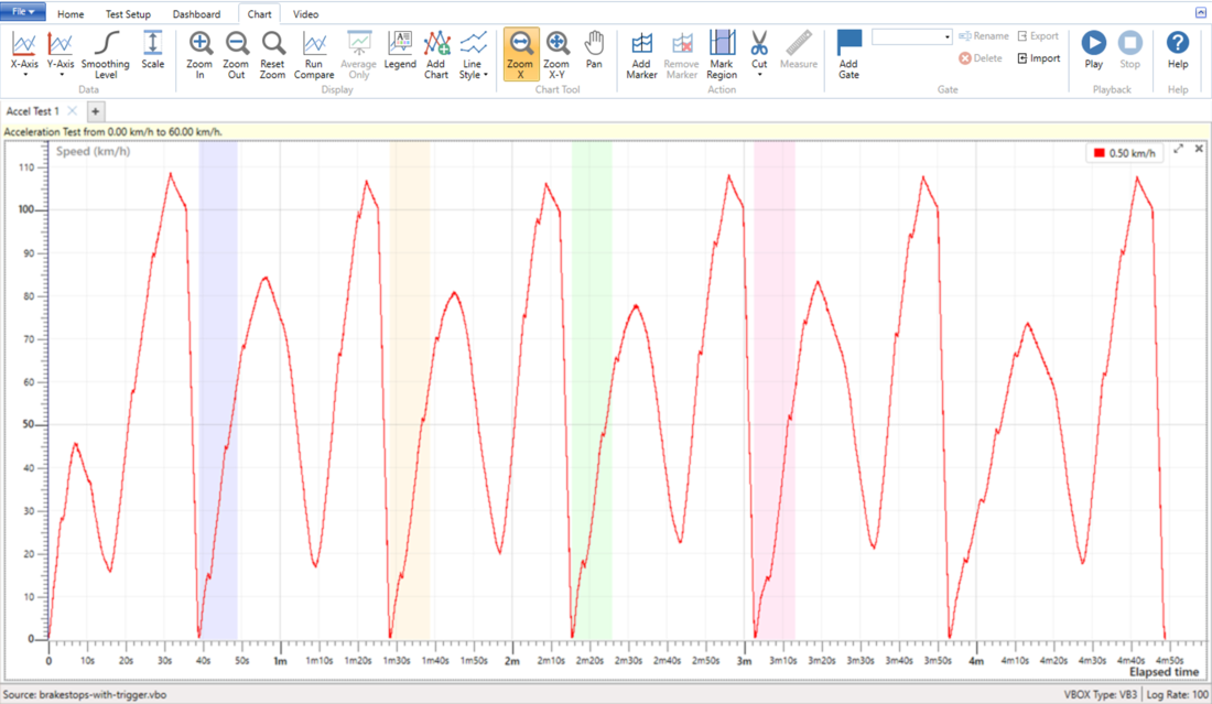
Standard display
Selecting the ‘Run Compare’ button will then show individual runs from the results table. When a run (or runs) are selected from the results area, those runs will be displayed on the graph with a common origin.
Note: Run Compare will be on by default when in 'Online' mode.
If a run starts or ends between data samples, the start and end values will interpolate between samples to provide the desired result. For example, if you are running a Decel Test (60 – 20 mph), any selected runs displayed within the graph will start at 60 mph and end at 20 mph, even if the data samples closest to the test criteria are 60.5 mph and 19.6 mph.
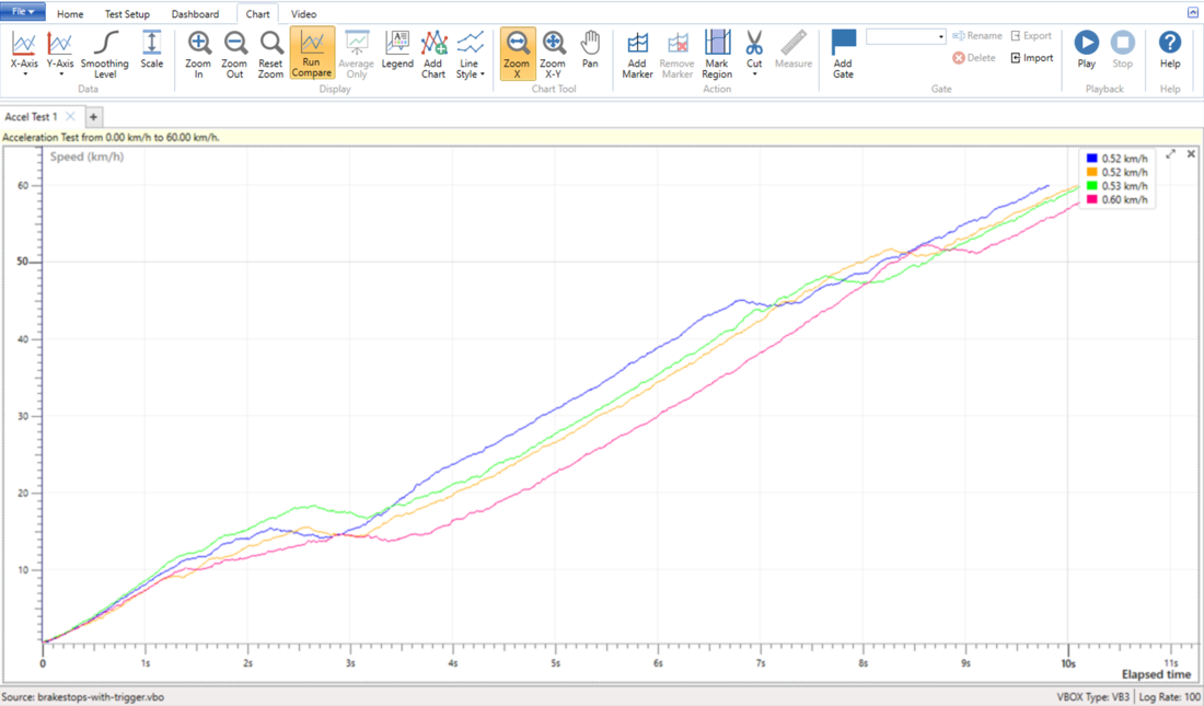
Run Compare selected
Average Only
If ‘Avg’ has been ticked within the results of a test, selecting the 'Average Only' button will display only the average ‘best fit’ curve of all selected runs.
Legend
The 'Legend' button allows the user to display a detailed legend that indicates which file or run each coloured trace belongs to. When the button is pressed, a fly out window will appear from the legend to show the names of any selected files or runs.
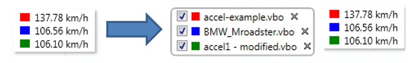
This expanded legend also allows the user to show and hide the traces from the graph and also to remove the file completely from that test.
Clicking on the colour square will allow the user to change the colour of the related channel traces.
Add Chart
The 'Add chart' button allows the user to add a chart that has an independent x axis from the existing Chart(s).
Line Style
The 'Line Style' button opens a dropdown menu where you can choose whether you would like chart lines to be viewed 'Sharp' (default), which details every deviation, or 'Normal', which provides a slightly smoothed trace. There is also the option to select (default)/ deselect the showing of individual GPS logging points.
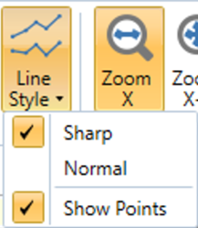
Chart Tool
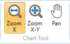
Zoom X
The 'Zoom X' button defines how the left click and drag action is performed. When selected, Left clicking and dragging the cursor to the right will perform a horizontal zoom of that area. To return to the full view, simply click and drag the cursor to the left.
Zoom X-Y
The 'Zoom X-Y' button defines how the left click and drag action is performed. When selected, Left clicking and dragging the cursor to the right will perform a ‘box zoom’ of that area. To return to the full view, simply click and drag the cursor to the left.
Pan
The 'Pan' button defines how the left click and drag action is performed. When selected, Left clicking and dragging the cursor will pan the graph accordingly. The pan action is only performed if the graph is zoomed.
Gate
The Gate area will mirror the gate options available in each test. You can find more information on the individual Test Page. If you have not chosen a test, the Gate area will default to the following:

Add Gate
Clicking the Add Gate button will add a virtual gate to the chart and map at the point of the cursor. You can also add a gate at your current location by pressing the space button on your keyboard. The gate is indicated by green lines. The currently selected gate will be indicated by a blue line.
When you have added a gate, you can specify the gate width. The default gate width is 20 m.
| Note: If you change the gate width, the last used gate width will be used as the default width for the next gate. |
You can now use the gates as start or end conditions.
| Note: Opening a plugin (either as a new tab or overwriting an existing one) will clear all set gates. If you do this you must, therefore, redefine the gates before you amend the test configuration to set start/end conditions. |
|
IMPORTANT When you want to add a gate, you must make sure that the vehicle is travelling faster than 0.8 km/h. This is so that the system can ascertain the heading for the gate. |
Rename
Click on this button to rename the currently selected gate line.
Delete
Click on this button to delete the currently selected gate line.
Delete All
Click on this button to delete all set gate lines.
Export
Click on this button to export the created gate(s) as a .spl file that can be reused at a later date and can be used with another VBOX product.
Import
Click on this button to import a previously saved or provided .spl file. When this is imported, the gates will be added in the order that they were saved in the .spl file.
Action
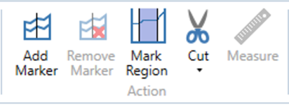
Add Marker
Pressing the 'Add Marker' button will add a marker to the chart at the current position of the cursor. Pressing the button again will add a secondary marker and the region between the two markers will be highlighted and allows further actions, such as cut and measure, to be performed. Only two markers can be added to the chart, however once placed, these markers can be moved by clicking and dragging the marker to a new location.
Remove Marker
'Remove Marker' deletes the last marker that was added to the chart.
Mark Region
The 'Mark Region' button changes the left click action of the chart. With the 'Mark Region' button selected, the user can click and drag on the graph to highlight a specific region that can be measured or cut. Selecting the 'Mark Region' button again will change the left click action of the chart to 'Zoom X'.
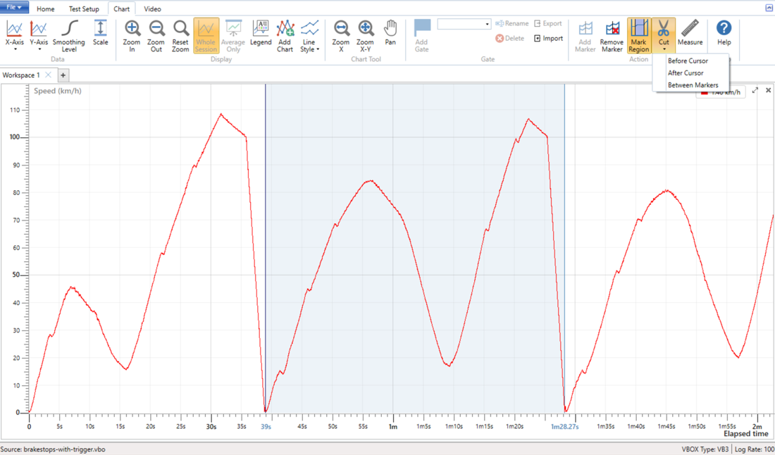
Cut
The 'Cut' button allows the user to remove a portion of the current file. This can be done in three ways:
- Cut Before Cursor – Will remove all data from the start of the file up until the cursor location.
- Cut After Cursor – Will remove all data from the cursor location up until the end of the file.
- Cut Between Markers – Will remove all data from in between the two marker locations.
Once the cut action has been performed, a warning will appear on the chart that the file contains unsaved changed. To save these changes, click the save within this warning.
Measure
Once a region has been highlighted within the chart area, it is possible to select the ‘Measure’ button. Once pressed, a new window will appear detailing the maximum, minimum and average values of all channels within that window. If a region starts or ends between data samples, the start, end, difference, maximum and minimum values will interpolate between samples to provide the desired result. The average value is computed from sample values only.
Double clicking on a 'Min' or 'Max' value will move the chart cursor to that location.
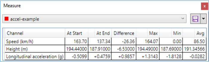
It possible to then export the displayed results to either a .csv file or to the clipboard ready to be pasted into another document.
Playback
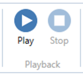
Use the playback buttons to play or stop the real time recording of any data along with any associated video.
Note: Not available when the 'Run Compare' button has been seleceted.
Help (F1)
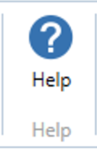
Pressing this 'Help' button will automatically open an internet browsing window and load the relevant section of the Racelogic Support Centre. This page will only be displayed if there is a valid internet connection. If there is no valid internet connection, a cached version of the relevant section (from the last software update) will be presented in PDF form. This can also be accessed by using the keyboard shortcut 'F1'.
Chart Functionality
Adding a Channel
VBOX Test Suite allows the user to display multiple channels on their own Y-Axis, as well as having the option to overlay channels from multiple files.
To add a channel to the graph, select the ‘Y-Axis’ button on the chart tab. Selecting this button will show a drop down list of all the channels available in the loaded files. Selecting the tick box next to a channel will automatically add that channel to the active graph on its own separate y-axis.
Note: Added channels will maintain the colour assigned to the run (unless they overlaid and the colours manually changed).
Overlaying Channels
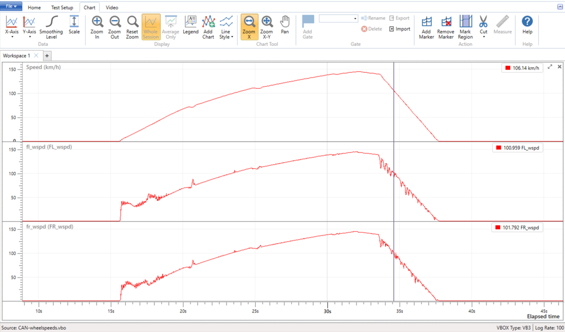
VBOX Test suite allows the user to overlay channels to compare the data traces on a common y-axis, for example when looking at Vehicle speed and wheel speeds.
Clicking and holding the mouse button on the channel name in the top left hand part of the relevant chart allows the user to drag that chart onto the chart that they would like to overlay.
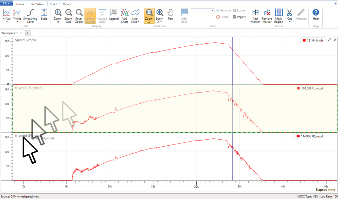
When that channel name is dragged over to another chart, that chart will be framed by a green box to highlight that the user can add that channel to the chart to produce an over lay of the signal traces.
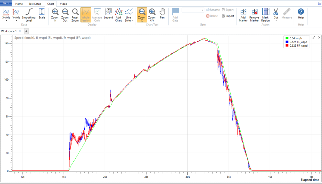
By default, all channels will remain the same colour, however the user can change the channel colour by clicking the colour square in the Chart Legend.
To return back to the original view where all channels are on a separate axis, the user can click on the ‘Restore’ button to the right of the combined channels name.
When a 'Trigger' channel is overlaid with other channels, it will be rescaled dependent on whether the channels are auto or manually scaled:
- If the other channel(s) is auto scaled, the Trigger will be rescaled to the minimum and maximum values of the channel(s).
- If the other channel(s) is manually scaled, the Trigger will be rescaled to the minimum value and 90% of the maximum value of the channel(s).
Changing the X-Axis
By default, all graphs will have elapsed time as the x-axis, however the user can choose to change this at any time by selecting the ‘X-Axis’ button on the chart tab. Selecting this button will display a drop down menu of all the available channels in the file that the user can select for the desired x-axis.
By changing the x-axis from continuous (i.e. time) to discreet data will automatically change the graph to display a scatter plot, rather than a line graph.
Navigating Around the Chart
VBOX Test Suite allows the users to zoom in and out of a graph, pan, and navigate from sample to sample and many more via a mixture of mouse clicks, keyboard short cuts and menu buttons.
Zooming
The user is presented with 3 ways to zoom the graph in and out, the first being the button in the Chart tab.
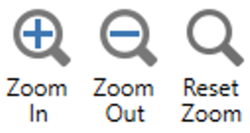
By pressing the ‘Zoom in’ or ‘Zoom out’ button, the graph will zoom in/out by 5%. The user can reset the graph to the default zoom level by pressing the ‘Reset Zoom’ button.
These buttons will also briefly appear next to the chart cursor any time the user clicks/touches anywhere within the chart area. The user can then use these buttons as above.
The final way to zoom is by using the left mouse button. By holding the left mouse button and dragging the cursor to the right, the graph will zoom in ‘horizontally’, where the y-axis remains the same size and only the x-axis changes. To zoom back out, left click and drag the cursor to the left. This returns the graph to its original view.
Saving the Zoom Area
Once zoomed into an area, it is possible to assign the zoomed region to a number by holding the ‘Ctrl’ key and a number key (1 through to 9). Once the region has a number assigned, it is possible to zoom back to that same point by pressing the same number key.
Panning
When zoomed in, it is possible to grab either the x or y axis and drag the axis up/down or left/right. Doing this will pan the graph accordingly.
The user can also hold the right mouse button and drag the graph to pan accordingly, or select the ‘Pan’ button in the ribbon bar and use the left mouse button.
Positioning the Cursor
The graph cursor can be positioned by various different ways. The first and easiest is by simply left clicking anywhere in the graph screen. This will move the cursor to the location that was clicked and display the associated values. The user can also click and drag the cursor left and right with the values constantly updating.
It is also possible to use the arrow keys to move left or right by one pixel at a time, allow the user to scroll through the data continuously.
If the ‘Alt’ key is pressed in conjunction with the arrow keys, the cursor will jump to the next sampled point, rather than just scroll through the interpolated values.
Advanced Controls
The graph area can be controlled in various different ways, as described below:-
Chart Area
| Action | Mouse | Keyboard |
|---|---|---|
| Horizontal Zoom In/Out 25 % | Wheel | Up/Down |
| Horizontal Zoom In/Out 5 % | Alt + Wheel | Alt + Up/Down |
| Vertical Zoom In/Out 25 % | Shift + Wheel | Shift + Up/Down |
| Vertical Zoom In/Out 5 % | Alt + Shift + Wheel | Alt + Shift + Up/Down |
| Zoom In/Out 25 % | Ctrl + Wheel | |
|
Zoom In/Out 5 % |
Ctrl + Alt + Wheel | |
| Horizontal Zoom In | Left Click + rubber band Right | |
| Horizontal Zoom In Full | Ctrl + Up | |
| Horizontal Zoom Out Full | Left Click + rubber band Left | Ctrl + Down |
| Vertical Zoom In | Shift + Left Click + rubber band Up | |
| Vertical Zoom In Full | Ctrl + Shift + Up | |
| Vertical Zoom Out Full | Shift + Left Click + rubber band Down | Ctrl + Shift + Down |
| Zoom In | Ctrl + Left Click + rubber band Right | |
| Zoom Out Full | Ctrl + Left Click + rubber band Left |
Backspace Alt + Ctrl + Shift + End |
| Pan | Right Click + Drag | |
|
Pan with rounding the axis position to labelled ticks |
Alt + Right Click + Drag Ctrl + Alt + Right Click + Drag |
|
| Move Cursor Left/Right 2 % of view width | Alt + PgUp/PgDn | |
| Move Cursor Left/Right 10 % of view width | PgUp/PgDn | |
| Move Cursor Left/Right 100 % of view width | Ctrl + PgUp/PgDn | |
| Position the Cursor | Left Click | |
| Move the Cursor | Left Click Cursor + Drag | |
| Centre the Cursor in the View | Num. | |
| Switch to Data Series or clear Data Series selection | Click on the Series name displayed in the Legend | |
| Switch to Next Data Series | Click on the Series name displayed in the Legend | ] |
| Switch to Previous Data Series | Click on the Series name displayed in the Legend | [ |
| Move the Legend to another position within the Graph | Click the Legend + Drag |
Common
| Action | Keyboard |
|---|---|
| Move Cursor One Pixel Left/Right | Left/Right |
| Move Cursor One Sample Left/Right | Alt + Left/Right |
| Move to Previous/Next Marker or Start/End if no markers | Ctrl + Left/Right |
| Move to First/Last Sample in the view or Beginning/End of Selection | Home/End |
| Move to Start/End | Ctrl + Home/End |
| Save the current View (zoom and position) under <Number> |
Ctrl + (1-9) Ctrl + Shift + (1-9) |
| Restore the View (zoom and position) from <Number> | (1-9) |
| Cut the data before the cursor location | Shift + X |
| Cut the data after the cursor location | Ctrl + X |
Chart Axis
| Action | Mouse |
|---|---|
| Centre the clicked value | Double Click |
| Pan the axis | Click + Drag |
| Pan the axis attracting labelled ticks to the left/bottom edge of the chart | Alt + Drag |
Save/Copy Image
Right clicking within the Chart area allows the user to either copy the view currently seen within the map window as an image to the computer clipboard, or save locally as a .png, .bmp, .gif, .jpg or .tif file.
Voice Tags
When a logged VBOX data file .vbo is loaded and displayed in the Chart, any associated .wav audio voice tag files will appear below the speed data trace as speaker icons ![]() and a vertical line will indicate the exact location of the start of the recording.
and a vertical line will indicate the exact location of the start of the recording.
The audio files can be played by clicking on the speaker icons. The icon will animate to indicate the audio file is being played.
More information on recording audio tags with a VBOX 3i can be found here.