VBOX Video HD2 software comes supplied with a library of bar graph elements. The user also has the option to create their own bar graph using a PNG, JPEG or BMP image file.
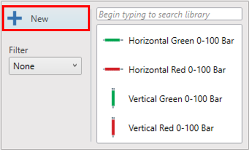
Open the bar graph library by clicking the ‘Bar’ icon from the top menu.

Open the bar graph library by clicking the ‘Bar’ icon from the top menu.

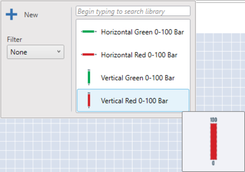
A drop-down menu will then appear, allowing a bar graph to be selected from the library. Clicking on a chosen bar graph will load it into the scene.
NOTE
Hovering over any of the bar graph thumbnails will cause a larger preview of the bar graph to appear.
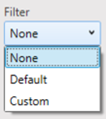
Selecting the 'Filter' drop down on the left enables you to filter the Bar Graphs shown between default and custom created.

Selecting the 'Filter' drop down on the left enables you to filter the Bar Graphs shown between default and custom created.
Once a bar graph has been added to the scene, it can be clicked and dragged to the desired location.
Bar graphs within the library will have pre-defined settings.
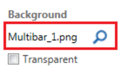
When creating a new bar graph element, an image for the background is required, unless using a transparent background, in which case tick the ‘Transparent’ option. An example image is shown below.
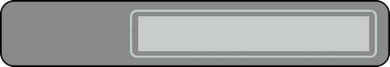
When creating a new bar graph element, an image for the background is required, unless using a transparent background, in which case tick the ‘Transparent’ option. An example image is shown below.
NOTE
Images can be resized within HD2 software.
To create a new bar graph, click the ‘Bar’ icon from the top menu.
To create a new bar graph, click the ‘Bar’ icon from the top menu.
Within the drop down menu, selecting the ‘New’ option will add a new bar graph element into the scene.
Double click on the new bar graph to load a background image.
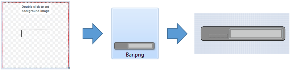
Now the background image has been loaded, the settings of the bar graph can be defined.
When an element is selected, its settings are shown in the right hand panel.
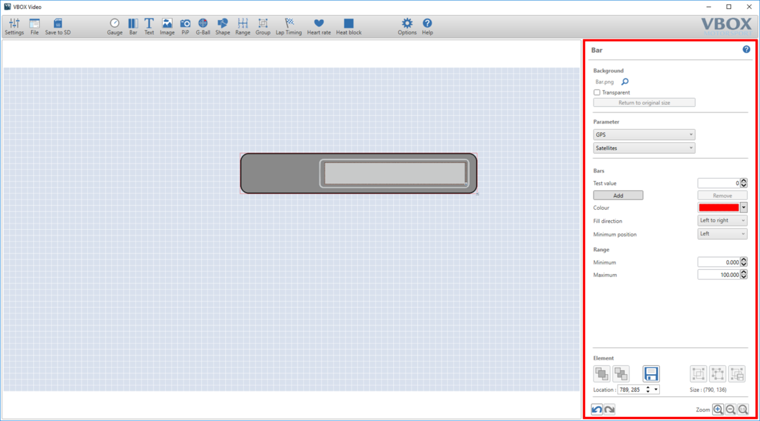
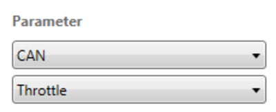
The data set to display on the bar graph can be changed using the two drop-down menus within the parameter section.
The first drop-down menu defines the source. Select either CAN, GPS, Heart rate monitor (if being used with a heart rate element), Maths Channels or OBD.
NOTE
CAN, Maths Channels and OBD options will only appear if they have been set up by the user.
The second drop-down list defines the channel to be shown. In the example above, a CAN input is set to display Throttle pedal data.
A number of GPS parameters are available to choose from, such as the following:
- Satellites
- UTC time
- Latitude
- Longitude
- Speed
- Heading
- Height
- Longitudinal acceleration
- Lateral acceleration
- Combined acceleration
- Vertical speed
- Local time
- Day of month
- Month
- Year
- Distance since power-up
- Distance since stationary
- Time stationary
- Time moving
- Radius of turn
- Gradient (%)
- Solution type
More information on the parameters can be found here.
Within the parameter section, speed, acceleration or distance channels can be set to display in different units.
The options available are:
- Speed – km/h, mph, kts, m/s, ft/s
- Acceleration – g, m/s², ft/s²
- Distance – m, ft, km, mi, nmi
Move the bar graph fill area to the desired location and re-size it using the icon in the bottom right corner.

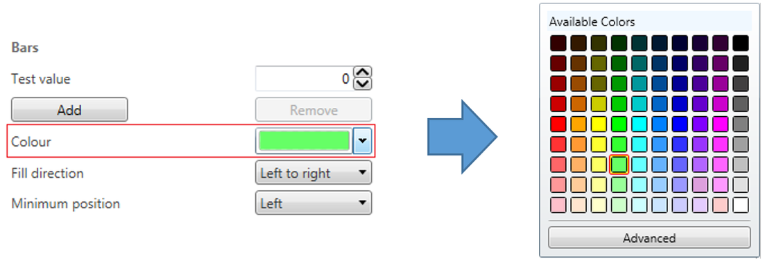
After the bar size and location has been set, choose the colour the bar will fill with.
To set a specific RGB colour, click ‘Advanced’.
Set the direction in which the bar graph will fill.
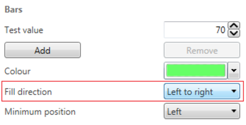


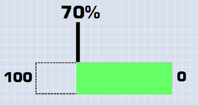


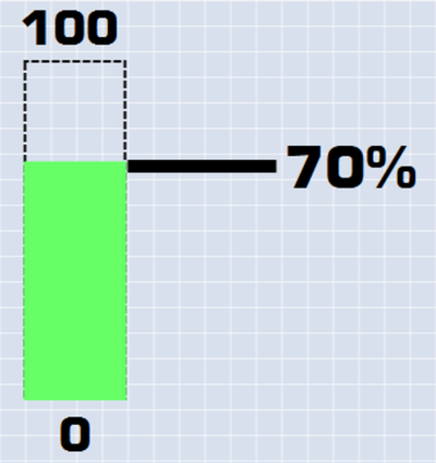
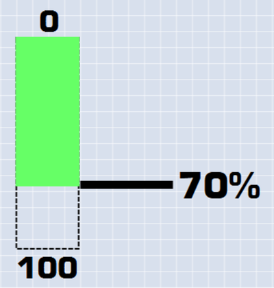
The minimum position setting will automatically move depending on fill direction. For most cases, the user will not need to change this.
If configuring a bar graph for a negative value, the minimum position may need to be changed.
For example:
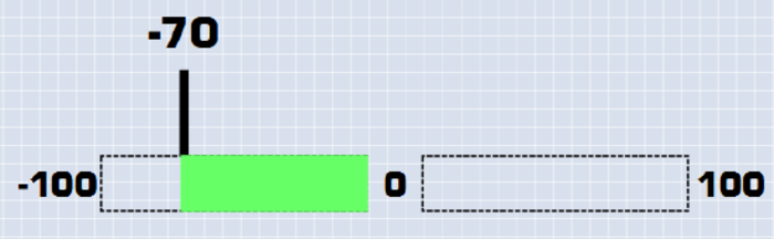

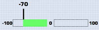
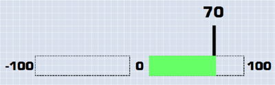
As the left hand bar graph is showing negative values, it will need to be set as shown below.
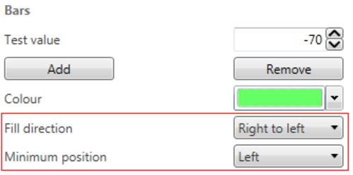
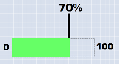
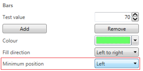
The last step is to define the minimum and maximum values of the bar graph. Use the 'Test Value' box to check what will be shown when different values are received.
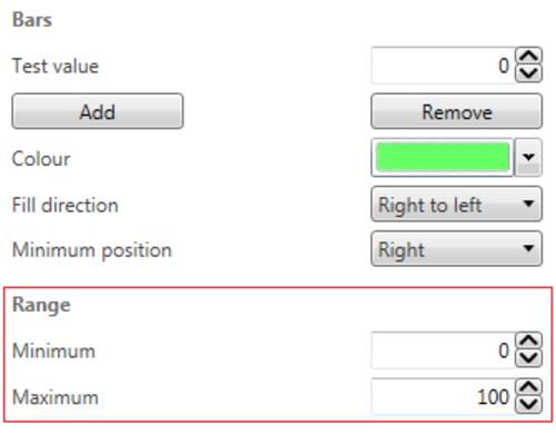
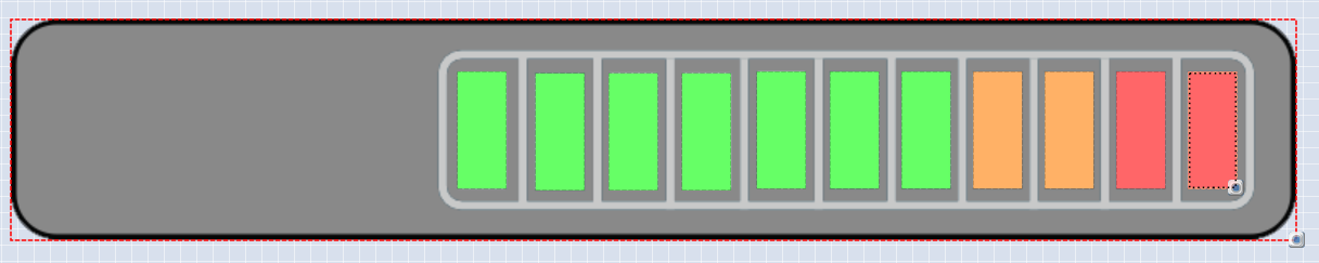
Multiple bars can be added into a single bar graph element. When using multiple bars, the process above must be followed for each bar individually.
Additional bars are added into a bar graph element using the ‘Add’ button.
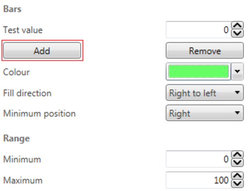
To set up each bar, click on it so it is highlighted. The settings defined in the 'Bar' area will apply to the selected bar.
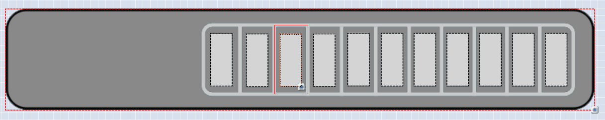
Each bar can have its range, colour and fill direction defined individually.
NOTE
Only one parameter can be set to a bar graph element.
Bar graph background images can be changed by clicking the search (magnifying glass) icon next to the currently loaded image.
NOTE
The backgrounds can be made transparent by ticking the ‘Transparent’ option.
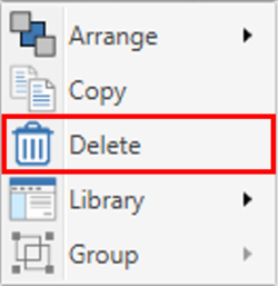
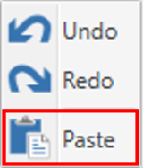
Elements and their associated settings can be duplicated within a scene by either right clicking on the element, selecting 'Copy' from the dropdown then right-clicking in an empty area and selecting 'Paste' from the dropdown, or by using keyboard shortcuts 'Ctrl + C' (Copy) and 'Ctrl + V' (Paste).

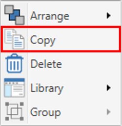

Elements can be removed from the scene in two ways; either by right-clicking on the element, selecting 'Delete' from the dropdown and confirming the prompt, or by pressing the 'Delete' key on a keyboard, and again, confirming the prompt.